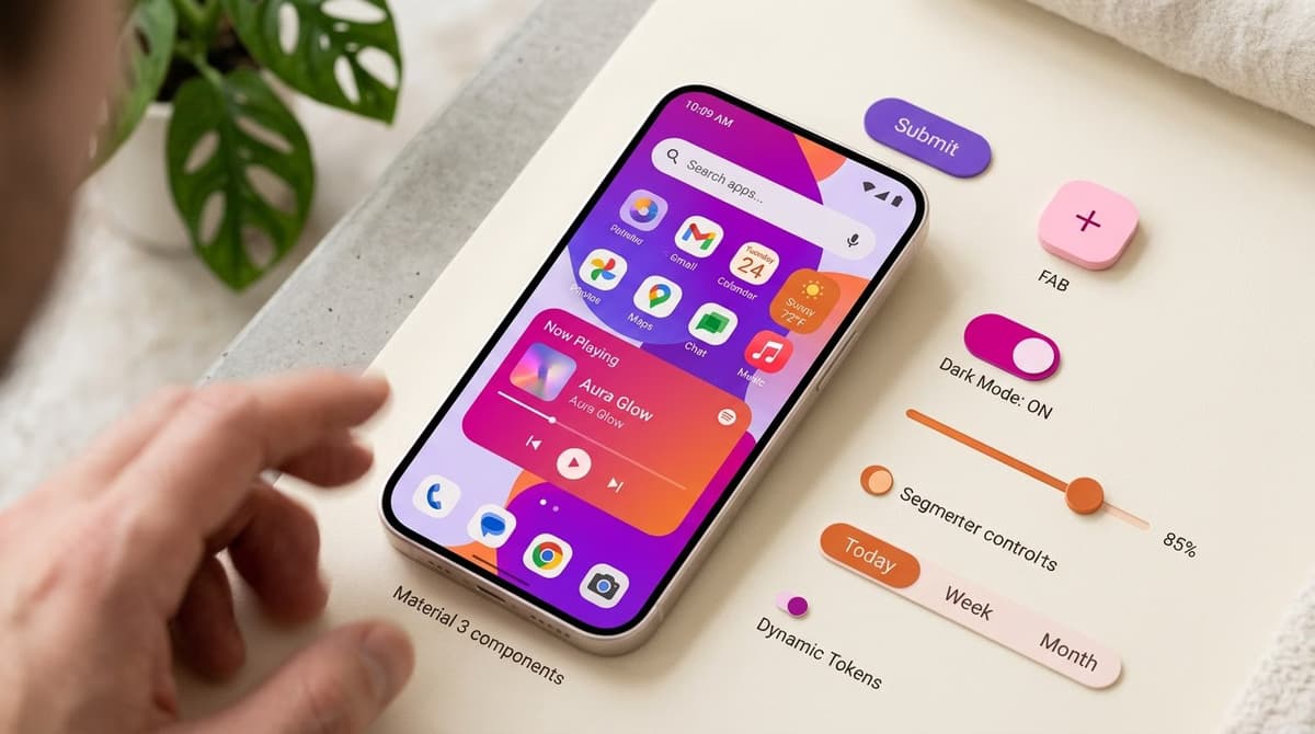
Material Design 3 (also known as Material You) is the third major iteration of Google's design system. It launched in 2021 with Android 12 and has become mainstream in 2024-2025. It's the most ambitious overhaul of Material Design since its original 2014 launch, introducing entirely new concepts like dynamic color, formalized design tokens, and the new expressive style with richer animations.
In this article, we'll break down what's really new compared to Material 2 (the version many designers still confuse with M3), how dynamic color works, why design tokens matter, and—most importantly—when it makes sense to adopt M3 in your projects.
What Is Material Design 3?
Material Design 3 is Google's official design system for Android, ChromeOS, Wear OS, and increasingly, for web apps built with frameworks like Angular or React via Material Web Components. It includes:
- A component library with over 60 ready-to-use base components
- A standardized set of design tokens for color, typography, motion, and elevation
- Official tools like the Material Theme Builder Figma plugin
- Accessibility guidelines compliant with WCAG 2.2
- Motion and animation patterns

5 Key Differences: M3 vs. M2
1. Dynamic Color (The Biggest Change)
In Material 2, every app had a fixed color set defined by the brand. In Material 3, the app's colors can be automatically derived from the user's wallpaper (on Android 12+). This is dynamic color: the app visually adapts to the user's preferences.
How it works: M3 uses an extraction algorithm that analyzes the wallpaper and generates five tonal palettes (primary, secondary, tertiary, neutral, and error), each with 13 tones. The app then applies these tones at runtime.
2. Formalized Design Tokens
Material 2 used ad-hoc, CSS-like values. Material 3 introduces a formal, three-level token ontology:
- Reference tokens: The raw values (e.g.,
md.ref.palette.primary40) - System tokens: Semantic values (e.g.,
md.sys.color.primary) - Component tokens: Values for specific components (e.g.,
md.comp.button.label-text-color)
This system allows you to change a single reference token (like the primary color) and have it automatically propagate across hundreds of components without manual updates.
3. Revised Typography
Material 3 uses a more expressive type scale with five roles (display, headline, title, body, and label) and three sizes for each role (large, medium, and small). This results in 15 predefined typographic styles, compared to 13 in M2, offering a clearer visual hierarchy.
4. Shape System
For the first time, Material formally encodes border-radius values as tokens (none, extra-small, small, medium, large, extra-large, and full). As a result, designers can now choose a category like "small radius" instead of a hard-coded value like "8px."
5. Expressive Style (New in 2024)
The expressive style, introduced in 2024 with Android 14, emphasizes emotion and personality through richer animations, more visible microinteractions, and transitions with "sproingy" curves. It's optional; teams can stick with the more subdued "medium" style.
When Should You Adopt Material Design 3?
Adopt It for Android Development
On Android, Material 3 isn't a choice—it's the standard. Apps that ignore M3 look dated and fail to integrate with the system's native dynamic color feature.
Use with Caution on iOS
Apple's Human Interface Guidelines (HIG) use very different patterns from Material. An Android-style app feels out of place on iOS. If your app is cross-platform, consider building separate UIs or using a more neutral design system like Tailwind UI or Shadcn.
It's a Solid Choice for the Web
Material Web Components (MWC) have been production-ready since 2023. They are a solid choice, especially if you're already in the Google ecosystem, want guaranteed out-of-the-box accessibility, and your brand can align with a "Google-ish" look and feel.
Material Theme Builder: The Essential Tool
The Material Theme Builder is the official Google Figma plugin for generating an M3 theme from a seed color or an image. The workflow is simple:
- Open the plugin in Figma.
- Input a seed color (your primary brand color) or upload an image.
- The plugin automatically generates the five tonal palettes (primary, secondary, tertiary, neutral, and error).
- Download the Figma file with all M3 components styled in your new colors.
- Export the theme as CSS variables or JSON tokens for your development team.
It's free and officially supported by Google. For rapid prototyping of new Android products, it's the fastest way to get started.
Best Practices for Using M3 in Figma
- Use Variables: M3 is most powerful when paired with Figma Variables (introduced in 2023). Without them, you lose half the value.
- Build for Modes: Set up light and dark modes from the start using variable modes—M3 supports both natively.
- Don't Over-Customize Components: M3 provides well-designed patterns. If you find yourself heavily customizing components, it's likely the wrong system for your project.
Alternatives to Material Design 3
If M3 isn't the right fit, consider these alternatives:
- Apple HIG: For native iOS apps.
- Carbon Design System (IBM): For enterprise B2B products.
- Polaris (Shopify): For e-commerce experiences.
- Atlassian Design System: For productivity tools.
- Tailwind UI / Shadcn: For custom web projects requiring full control.
Frequently Asked Questions
Is Material 2 still supported by Google?
Material 2 has been in maintenance mode since 2022. It only receives critical bug fixes, not new features. All new projects should start with M3. Migrating from M2 to M3 typically takes 4-12 weeks for a medium-sized app.
Does dynamic color work on the web?
Technically, yes, if the user grants access to their wallpaper via a specific browser API. In practice, however, no major desktop browser supports this API. Dynamic color is primarily an Android feature.
Can I use Material 3 with my existing brand colors?
Yes. You can input your brand color as a "seed" in the Material Theme Builder. M3 will automatically generate derivative palettes that harmonize with it. The result won't be your exact brand color everywhere, but it will be consistent.
Can I use it with React/Next.js?
Yes, via two main paths: 1) @material/web components (official from Google, vanilla web components); 2) @mui/material (Material UI, a popular third-party React library, which is based on M2 with M3 support on its roadmap).
Should I learn it as a junior designer?
Absolutely. M3 is one of the world's most well-documented design systems. It's free and teaches principles (tokens, semantic naming, accessibility) that apply everywhere. It's a great learning tool even if you never work on an Android app.
Next Steps
Learning to build (and maintain) design systems like Material 3 is an advanced UI Designer skill. The UI & Visual Design Course by CorsoUX covers design systems, color systems, typography scales, and Figma Variables across 12 chapters and 101 lessons. You'll get 1:1 mentor feedback on your exercises.
To dive deeper into related concepts, check out our guides on what is a design system, the Atomic Design methodology, and our Figma tutorial.