Mobile usability principles aren't an academic list to memorize. They're a synthesis of physical constraints (the thumb, the small screen, outdoor light), cognitive ones (fragmented attention, use on the move), and technical ones (touch, variable connectivity) that decide whether an interface is actually usable or just theoretically "clickable."
This article covers the usability principles a mobile designer needs to master in 2026, with concrete examples and measurable references. Unlike the general Nielsen heuristics that apply to any interface, here we focus on the ones specific to mobile — where space, context, and input rewrite the rules.
What you'll learn:
- The 7 core mobile usability principles
- Touch target sizes and why they matter
- The hierarchy of thumb-reachable areas
- How to design for real usage contexts (on the move, in sunlight, while multitasking)
- The measurable references (WCAG, HIG, Material) to cite in design reviews
1. Know your users and their usage context
The first principle is also the most betrayed: a mobile interface isn't designed "in the abstract." It's designed for a specific user in a specific context.
Key questions:
- Who will use it? Age, digital fluency, frequency of use.
- Where? At an office desk vs. on the subway vs. at a coffee shop vs. on the couch.
- When? In moments of full focus vs. 30-second pauses.
- How? One-handed or two, standing or sitting, with or without sound.
- Why? High motivation (they need it) or low (browsing around).
A banking app used "one minute at a time in the supermarket line" has different requirements from a productivity app used "30 minutes at the desk in the morning." The first needs concise screens with the key information visible on impact; the second can afford denser interfaces.
No usability principle says "more white space is better." It says "match density to context." If your research shows users engage in short, hurried sessions, you design for that — not for the relaxed laptop session of a designer.
2. Touch targets: the 44×44 minimum
A touch target is the clickable area of an interactive element. Too small and users misfire and get frustrated; too big and you waste precious screen space and reduce useful density.
The two major mobile ecosystems' official guidelines converge on a minimum:
- Apple Human Interface Guidelines: 44×44 pt
- Material Design (Google): 48×48 dp
- WCAG 2.2 (Level AAA): 44×44 CSS pixels
These numbers correspond to about 9–10mm, the average fingertip pad of an adult. Below this threshold misclick rates rise fast; above 60×60 the gains flatten.
What those numbers mean in practice
- Primary buttons: always above 44×44, often 48×48 or more.
- Tap icons (menu, notifications, profile): 44×44 minimum. You can show a visually smaller icon with an extended tap area (hit slop).
- Inline text links: hard to make 44×44 — compensate with generous vertical padding and line spacing.
- List rows: minimum 44–48pt height for confident tapping.
The most common violation: small icons (16–20px) packed together in a toolbar. Visually clean, operationally frustrating.
3. Thumb-reach zones
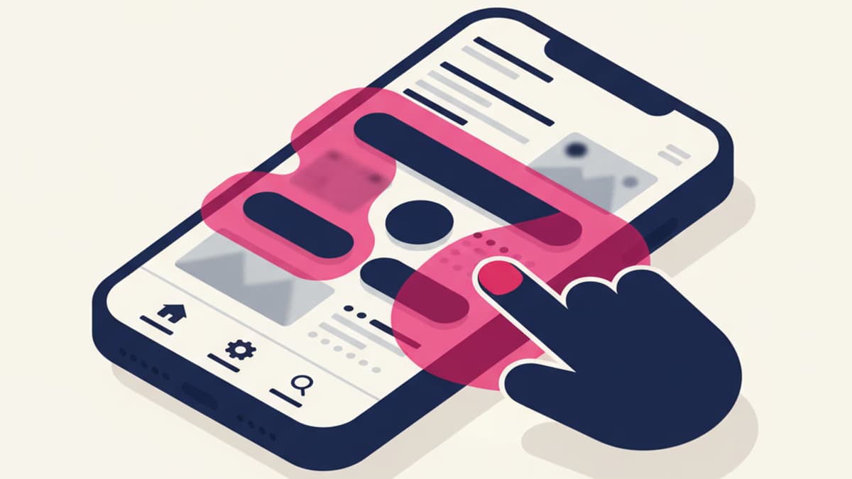
A mobile screen isn't a uniform surface. When someone holds the phone one-handed (the most common case), some areas are easy to reach with the thumb, others require moving the grip.
Steven Hoober, in his classic research on mobile holding postures, mapped three zones:
- Green zone (natural thumb): the bottom center of the screen. Easy, fast.
- Yellow zone (thumb with slight effort): the sides and middle.
- Red zone (thumb with significant effort): the top corner opposite the dominant hand.
Practical implications
- Primary actions go in the green zone. That's why 95% of modern mobile apps have a tab bar at the bottom, not the top.
- Destructive or rare actions belong in the red zone. A "log out" top-right is far from the thumb, which makes it hard to tap by accident.
- The top bar (where system status lives) is physically awkward for frequent interaction. Use it for passive information (title, notifications) or rare actions (settings, search).
This rule rewrote mobile UI between 2013 and 2018: from hamburger menus at the top (inherited from desktop web) to tab bars at the bottom (built for the thumb). Today it's the consolidated standard.
4. Immediate feedback on every action
On mobile, every tap needs a visible response within 100ms. Below that threshold the brain perceives the action as "immediate." Above 100ms, the user wonders whether the system even registered the tap.
Types of feedback
- Visual: color change, shadow, scale, ripple effect (Material)
- Haptic: short vibration — iOS and Android support standard patterns
- Audio: system click — usually muted, so unreliable as the only channel
Visual + haptic combined is best. Visual alone is enough in most cases.
What not to do
- Zero feedback: the clicked button shows nothing. The user clicks again, then again, until the page finally responds.
- Delayed feedback: 500ms after the click, a response finally appears. By then the user has tapped other things.
- Meaningless feedback: an 800ms fancy animation after every tap. Slowdown without information.
5. Strong, scannable visual hierarchy
Mobile has limited space and fragmented attention. Visual hierarchy needs to be aggressive: clear differences in size, weight, and color — not subtle ones.
Practical rules:
- Typography: at least 16px for body text (24px for primary headlines). Below 16px on mobile, legibility drops hard, especially with a smudged screen or in daylight.
- Contrast: WCAG AA (4.5:1) is the minimum. AAA (7:1) is recommended for content users read on the move.
- Spacing: generous between functional blocks. White space isn't empty — it's signage.
- Scannability: the user needs to understand in 2 seconds what's on the screen. Strong headings, clear sections, summaries up front.
Read the guide to typography and fonts in UX for more on mobile type sizing.
6. Designing for interruptions and harsh contexts
A mobile user is interrupted constantly: notifications, calls, subway, rain, direct sunlight, wet hands. The interface has to survive these interruptions.
Always save state
If a user is filling out a form and a call comes in, when they come back the form should be exactly where they left it. Frequent auto-save, state persistence, session recovery.
Readability in hard conditions
Visual design has to work at 100% brightness in sunlight and at minimum brightness at night. Regular testing in both conditions, not just in front of a monitor.
Offline content accessibility
A mobile connection is intermittent. A professional app in 2026 handles offline with clear feedback ("You're offline — your changes will sync when you're back online") and automatic retry.
Error tolerance
A user on the subway bumps the phone, taps by mistake, tries to undo. The interface has to:
- Confirm destructive actions
- Allow undo when possible
- Forgive small mistakes without resetting everything
7. Performance as part of usability
Usability isn't just visual: it's also speed. A gorgeous interface that takes 4 seconds to load is an unusable interface.
The targets to hit in 2026:
- First Contentful Paint (FCP): under 1.8s
- Time to Interactive (TTI): under 3.5s
- Largest Contentful Paint (LCP): under 2.5s
- Cumulative Layout Shift (CLS): under 0.1
These numbers come from Google's Core Web Vitals and are a fixed part of any modern UX audit. Missing them isn't just an SEO problem: it's a perceived-usability problem.
The designer contributes to performance through:
- Lightweight visual choices (fewer expensive effects, optimized animations)
- Optimized images (WebP, AVIF, proper sizing)
- Stable layouts that don't shift during load
- Skeleton screens instead of spinners to make loading feel faster
Frequently asked questions
What's the difference between usability and accessibility?
They overlap but aren't identical. Usability: how easy and pleasant the product is for the average user. Accessibility: whether people with disabilities can use it. An accessible interface is almost always more usable for everyone, but not automatically: some accessibility choices (auto-magnification, screen readers) aren't always needed by the average user. In the US, accessibility is governed by the ADA and Section 508; in the UK by the Equality Act 2010; and WCAG 2.2 is the common technical reference.
How big should a mobile button be?
Minimum 44×44 pt (Apple) or 48×48 dp (Material Design). Below that threshold misclick rates rise quickly. Above 60×60 the wasted space yields no meaningful benefit.
Do usability principles change between iOS and Android?
The cognitive principles are the same. Platform conventions differ: system back gesture on Android, edge-swipe back on iOS; bottom tab bars on both; Material vs. Cupertino visual styles. A professional app respects each platform's conventions instead of forcing a uniform design.
Can I design mobile-first for an app that's also used on desktop?
Yes, it's actually recommended. Mobile-first forces clear priorities and a simple structure; expanding to desktop is far easier than going the other way.
How do I measure my product's usability?
Three quantitative metrics and one qualitative: Task Success Rate (how many users complete the task), Time on Task (how long it takes), Error Rate (how many errors they make), and the SUS Score (System Usability Scale), a standard 10-question survey scored 0–100. A SUS above 80 is excellent, above 68 is above average, below 50 is a problem.
Do mobile usability principles apply to PWAs?
Yes. A Progressive Web App running on mobile has the same physical constraints (thumb, screen, context) as a native app. The main differences are technical (offline, install, notifications), not in core usability.
Next steps
Mobile usability is one of the most practical and measurable topics in UX Design. To keep going:
- Study the general usability heuristics that apply to mobile too
- Dig into mobile-first design
- Read the guide to the 5 states of design to cover every scenario
CorsoUX's Interaction Design course includes mobile design exercises with real usability tests and mentor feedback on projects you build yourself.