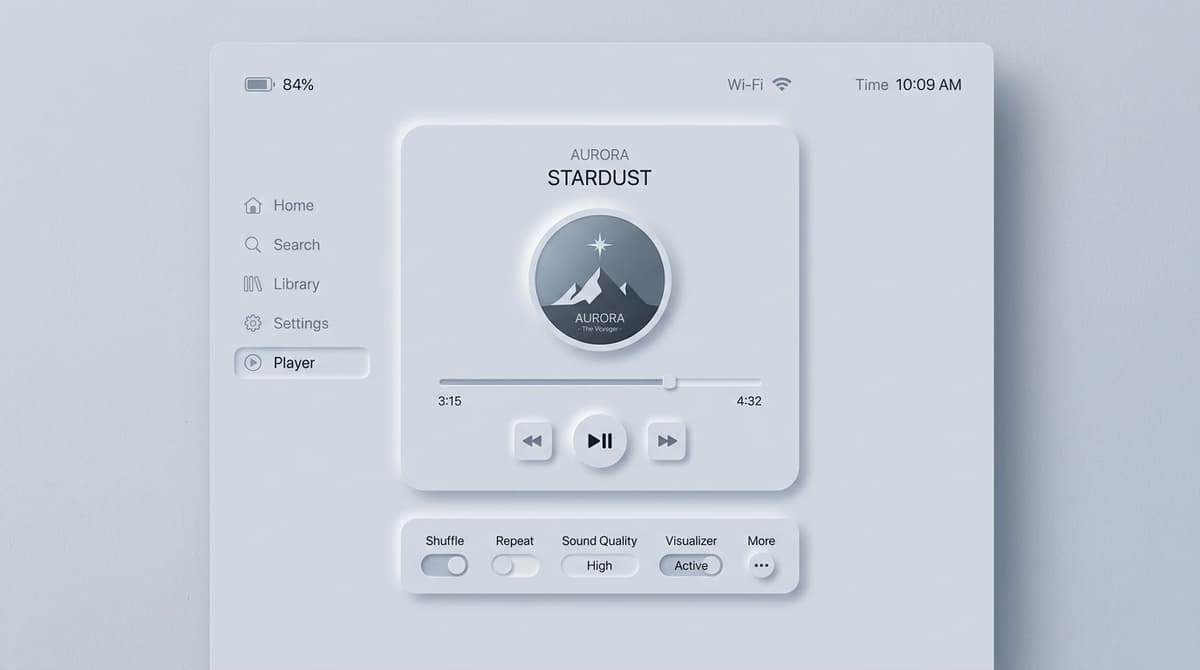
Neumorphism (or soft UI) is a visual style for interfaces where elements appear to softly extrude from or press into the background surface. This effect is achieved with two symmetrical shadows on the element's border: one dark and one light. It emerged in late 2019 from a Dribbble mockup by Alexander Plyuto that went viral, peaked in popularity during 2020-2021, and has since settled into a niche style.
In this article, we'll cover what neumorphism is, how to implement it, why—despite its aesthetic appeal—it has structural problems that limit its use, and in which specific contexts it makes sense to adopt it in 2026.
What Is Neumorphism
Neumorphism is an evolution of skeuomorphism (UI that mimics real-world objects, dominant from 2007-2013) and flat design (UI without shadows or depth, dominant from 2013-2020). It combines elements of both:
- It maintains the simplicity of flat design (clean lines, no realistic textures).
- It reintroduces the depth of skeuomorphism, but in a stylized way.
The result is a "soft," almost tactile aesthetic where elements seem to be molded from the same material as the background, as if they were sculpted or pressed into the surface.

How to Code Neumorphism in CSS
Neumorphism is achieved using two opposing shadows in the CSS box-shadow property:
.neumorphic-button {
  background: #e0e5ec;
  border: none;
  border-radius: 12px;
  box-shadow:
    8px 8px 16px #b8bec7,    /* dark shadow, bottom right */
    -8px -8px 16px #ffffff;  /* light highlight, top left */
  padding: 12px 24px;
}

.neumorphic-button:active {
  /* "pressed" effect */
  box-shadow:
    inset 4px 4px 8px #b8bec7,
    inset -4px -4px 8px #ffffff;
}
The three critical elements are:
- The button's background must be the exact same color as the page background.
- The dark shadow is a slightly darker version of the background (~10-15%).
- The light highlight is pure white or off-white.
The effect only works if the component's background is the exact same color as the page background. The illusion breaks on multi-colored or gradient backgrounds.
3 Core Problems with Neumorphism
1. Insufficient Contrast
Neumorphism relies on subtle tonal differences. According to WCAG 2.2 AA guidelines, UI components require a 3:1 contrast ratio against the background. A typical neumorphic element's contrast (a 10-15% brightness difference) is only about 1.2:1 to 1.5:1—far below the minimum. As a result, users with even moderate visual impairments may not be able to distinguish interactive elements from the background.
2. Poor Affordance
Affordance is a UI element's ability to communicate its function. A traditional button (a colored rectangle) screams "click me." A neumorphic button (a soft extrusion of the same material) merely whispers. Usability studies from groups like the Nielsen Norman Group have shown measurable drops in task completion rates with neumorphic buttons compared to flat or material design.
3. Limited Background Choices
Neumorphism only works on solid, monochromatic backgrounds—usually light ones (dark mode is possible but less common). This means no rich color palettes, no background images, and no gradients. This is a massive limitation for branding and marketing websites.
When Neumorphism Actually Works
Despite its limitations, there are three contexts where it makes sense:
1. Mindfulness and Wellness Apps
Apps like Calm, Headspace, or sleep trackers benefit from a "soft" aesthetic. The user is in a relaxed state, not trying to complete complex, high-stakes tasks. Here, low affordance is balanced by high visual comfort.
2. Single-Purpose Tools
When an app does one thing and the user has already learned the interface (e.g., a timer, a calculator, a simple dashboard), the problem of low affordance becomes marginal.
3. Premium and Luxury Branding
Brands aiming for a "premium" or "luxurious minimalist" feel can use neumorphism when the brand statement outweighs strict usability concerns. Examples include a landing page for a luxury watch or a booking app for a boutique hotel.
When to Avoid Neumorphism
- Apps with complex forms: Sign-ups, checkouts, configurators—users must be able to distinguish fields at a glance.
- Enterprise / B2B products: Decision-makers at companies like Salesforce or Oracle aren't evaluating your product on aesthetics.
- Apps for older adults or where accessibility is a priority: Low contrast creates barriers to entry.
- Complex marketing sites: You need high-contrast CTAs that convert, which neumorphism actively prevents.
How to Prototype Neumorphism in Figma
Figma perfectly supports neumorphism using two shadows in the "Effects" panel:
- Create a rectangle with the same color as your page background.
- Add a Drop shadow: set offset to 8/8, blur to 16, and use a color that is ~10% darker than the background.
- Add a second Drop shadow: set offset to -8/-8, blur to 16, and use white.
- For the "pressed" state, convert both shadows to Inner shadow.
Create a "neumorphic-base" style and apply it to all components for consistency.
Safer Design Alternatives
If you like the soft aesthetic of neumorphism but worry about its accessibility issues, consider these alternatives:
- Glassmorphism: A similar tactile feel but with much better contrast.
- Soft Material Design: Google's M3 with a rounded shape system and subtle shadows.
- Claymorphism: A variation with more pronounced shadows, resulting in better accessibility.
Frequently Asked Questions
Is Neumorphism Still Relevant in 2026?
It's a stable niche trend. It's not dominant (glassmorphism holds that spot), but it appeared in roughly 5-10% of new apps in 2025. It will likely continue at 3-5% in the coming years as a recognizable style for specific categories.
Does Neumorphism Work in Dark Mode?
Yes, and often it works even better. On a dark background, the tonal difference between the darker shadow and the light highlight is more perceptible. Most neumorphism tutorials showcase dark mode examples for this reason.
Neumorphism vs. Glassmorphism: Which to Choose?
Glassmorphism is more versatile and accessible. Neumorphism is more distinctively "different" but has serious limitations. For most commercial projects, glassmorphism is the safer and better choice. For artistic projects or brand statements, neumorphism can be considered.
Why Is Dribbble Full of Neumorphism?
Dribbble rewards aesthetic "wow factor," not usability. Neumorphism looks stunning in static screenshots and generates a lot of likes. However, many of the viral mockups on Dribbble would fail as real-world, usable products.
Can I Use It on a Single Component?
It's not recommended. Neumorphism is an all-or-nothing style; it needs to be applied consistently across the entire UI to work visually. A single neumorphic button in an otherwise flat UI looks like a design mistake.
Next Steps
Understanding when a visual trend works—and when it doesn't—is a core skill for any UI Designer. The UI & Visual Design Course from CorsoUX dedicates 101 lessons to fundamentals (hierarchy, contrast, accessibility) and the critical application of modern trends. You'll get 1:1 feedback from a mentor on every exercise.
To learn more, check out our guides on glassmorphism (a safer alternative), UI animations to enrich any style, and the WCAG guidelines to avoid common accessibility mistakes.