
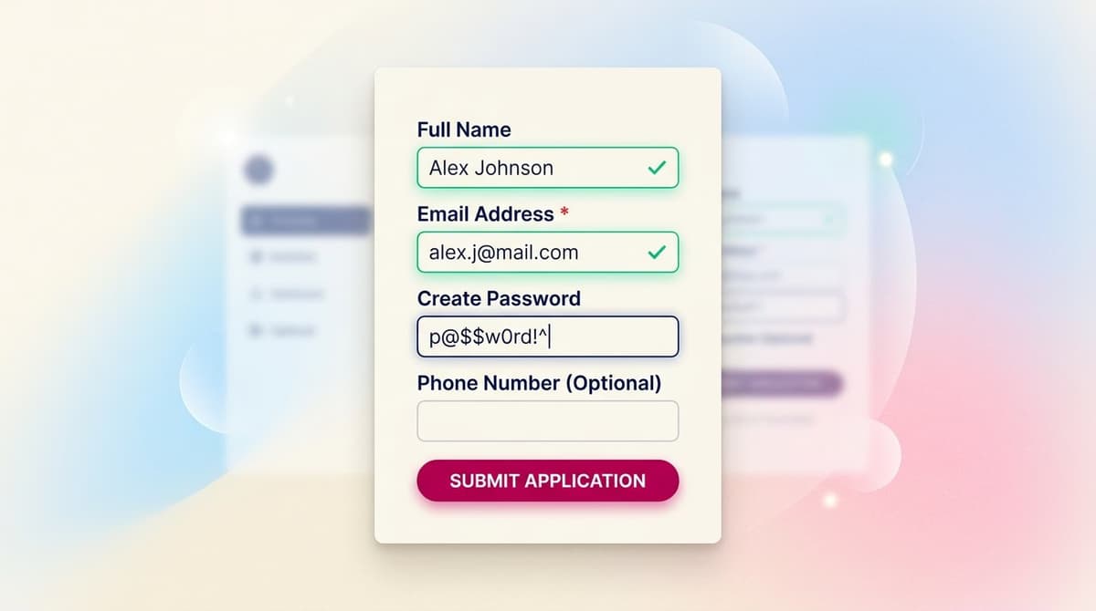
Forms are where every digital product meets reality. A brilliant landing page with a terrible form won't convert. A feature-rich app with a long signup form can lose 40-60% of users before they even log in for the first time. Form design is a UX sub-discipline that few designers take seriously, yet it has a disproportionate ROI: small tweaks can double conversion rates.
In this article, we'll cover 10 practical rules for designing forms that convert, based on decades of UX research (from Luke Wroblewski's 2008 "Web Form Design" to the latest data from the Baymard Institute) and our hands-on experience.
Rule 1: Keep Form Fields to a Minimum
The single biggest predictor of a form's conversion rate is its number of fields. Baymard Institute studies show that each additional field can decrease conversion by 4-7%. A form with 11 fields typically converts at half the rate of a 4-field form.
For every field, ask yourself: Can I get this information AFTER signup? The answer is often yes. Get the email and password at signup; collect profile data during the first onboarding. The marketing department will always ask for more fields—your answer should always be "no, we'll ask later."

Rule 2: Always Use a Single-Column Layout
Two-column forms might seem efficient, but they disrupt the user's vertical momentum. Eye-tracking studies show that users scan multi-column forms in a Z-pattern, often skipping fields and making mistakes. Single-column forms consistently outperform them in completion rate and accuracy in every public A/B test from the last decade.
The exception: closely related fields that belong together, like 'Zip Code' and 'City' or a credit card's expiration 'Month' and 'Year'.
Rule 3: Use Top-Aligned Labels
Labels placed above the input field (top-aligned) are universally better than left-aligned labels:
- Fewer eye movements → faster completion
- Works in all languages (including RTL)
- Adapts seamlessly to mobile screens
- Allows for longer labels without breaking the layout
Using placeholder text as labels is a terrible idea. They disappear as the user starts typing and create major accessibility issues for screen reader users.
Rule 4: Mark Optional Fields, Not Required Ones
The common convention is to use an asterisk * for required fields. This is wrong. Most fields in a form are required, so you end up with asterisks everywhere, creating visual noise.
Invert the pattern: explicitly mark ONLY the non-required fields with "(optional)". Everything else is assumed to be required. Public tests (e.g., by UXPin) show this simple change can increase form completion rates by 5-10%.
Rule 5: Use Inline Validation, Not on Submit
Inline validation (checking for errors as the user fills out the form, not just on submit) reduces errors by 22% and increases completion speed by 42%, according to studies by Luke Wroblewski.
The correct pattern:
- Validate on blur (when the user leaves the field), not on every keystroke (which is too aggressive).
- Show errors in red near the field, accompanied by an icon.
- Show success states subtly in green (don't celebrate every valid field).
Rule 6: Write Clear Microcopy for Every Field
The microcopy in your forms is critical:
- Specific labels: "Full Name" not "Name", "Work Email" not "Email"
- Helper text for ambiguity: "We'll only use this to recover your account"
- Specific error messages: "Please enter a valid email address" not "Invalid email"
- Descriptive button text: "Create Your Free Account" not "Submit"
Every word in a form matters. Spending an hour rewriting microcopy can boost conversions by 5-10%.
Rule 7: Design Mobile-First, Always
Over 60% of global web traffic is now mobile. A form that works well on mobile will work well on desktop. The reverse is not true.
Mobile best practices:
- Large, finger-friendly tap targets (height ≥48px)
- Ample vertical spacing between fields (≥16px)
- The right keyboard for each field:
type="email",type="tel",inputmode="numeric" - Auto-capitalize names, but not email addresses
- Enable auto-complete (let the browser do half the work)
Rule 8: Show Password Requirements Upfront
The wrong pattern: a user chooses a password, hits submit, and gets an error: "Password must be 8+ characters with 1 number, 1 symbol, and 1 uppercase letter." This is frustrating.
The right pattern: display password requirements as soon as the field is in focus. Use a live checklist that updates as the user types. This can reduce abandonment on signup forms by 25-30%.
Rule 9: Break Long Forms into Steps
For forms with more than 7-8 fields, a single long page can feel overwhelming. Break it into steps:
- Step 1: Basic info (3-4 fields)
- Step 2: Specific details (3-4 fields)
- Step 3: Confirmation and CTA
Show the user a progress bar. Allow them to go back without losing data. Save progress in localStorage so they don't lose it if they accidentally close the tab.
Multi-step forms convert 15-25% better than long single-page forms, according to data from Crazy Egg.
Rule 10: Test, Test, and Test Again
Everything above is a general best practice. For YOUR form, only YOUR user data matters. Implement A/B tests on your form: test different labels, button placement, CTA copy, and the number of fields.
A priority test set for a typical registration form:
- Number of fields (4 vs. 6 vs. 8)
- CTA button microcopy ('Create Account' vs. 'Start for Free' vs. 'Sign Up Now')
- Position of privacy/terms links (above vs. below the button)
- Single-page vs. multi-step layout
Accessible Forms (Essential, Not Optional)
An inaccessible form is a broken form. At a minimum, meet WCAG 2.2 standards:
- Every field has an associated
<label>for screen readers. - Errors are communicated with
aria-invalidandrole="alert". - Focus indicators are clearly visible (no
outline: nonewithout a replacement). - Color contrast between text and background is at least 4.5:1.
- Everything is keyboard navigable (Tab to the next field, Enter to submit).
See our complete WCAG guide for details.
Frequently Asked Questions
Should I use a CAPTCHA?
Only if you have a real bot or spam problem. CAPTCHAs can reduce conversions by 3-10% due to user frustration. Start without one, and only add it if you see measurable bot traffic. If you must, use an invisible solution like hCaptcha or reCAPTCHA v3.
Is it worth adding social logins (Google/Apple)?
Yes, for B2C products, it can boost conversions by 20-40%. Offer all three: Google, Apple, and standard email. For B2B, social login is less common; consider corporate SSO instead.
Should I require immediate email confirmation (double opt-in)?
Yes, for newsletters or low-engagement services. No, for product signups where user intent is high (e.g., during checkout). Double opt-in reduces conversions by 15-20% but improves lead quality.
For long forms, should I show progress as a percentage or steps?
Steps ('Step 2 of 4') beat percentages in completion rates. It's psychologically clearer: the user knows exactly what's left. A percentage can feel misleading if steps have different lengths.
Can I optimize forms as a junior designer?
Yes, it's one of the most accessible areas of UX. The best practices are well-documented (Baymard, NN/g, Luke W.). Start by testing a single form (like signup), measure metrics before and after, and iterate. You'll see measurable improvements in 2-3 cycles.
Next Steps
Form design is a core skill for an Interaction Designer. The Interaction Design Course at CorsoUX includes dedicated chapters on forms, microinteractions, validation, and prototyping multi-step flows in Figma. You'll get 1:1 mentorship on your exercises.
To dive deeper into related concepts, check out our guides on microcopy that converts, how to design effective CTAs, our practical guide to A/B testing, and WCAG accessibility.